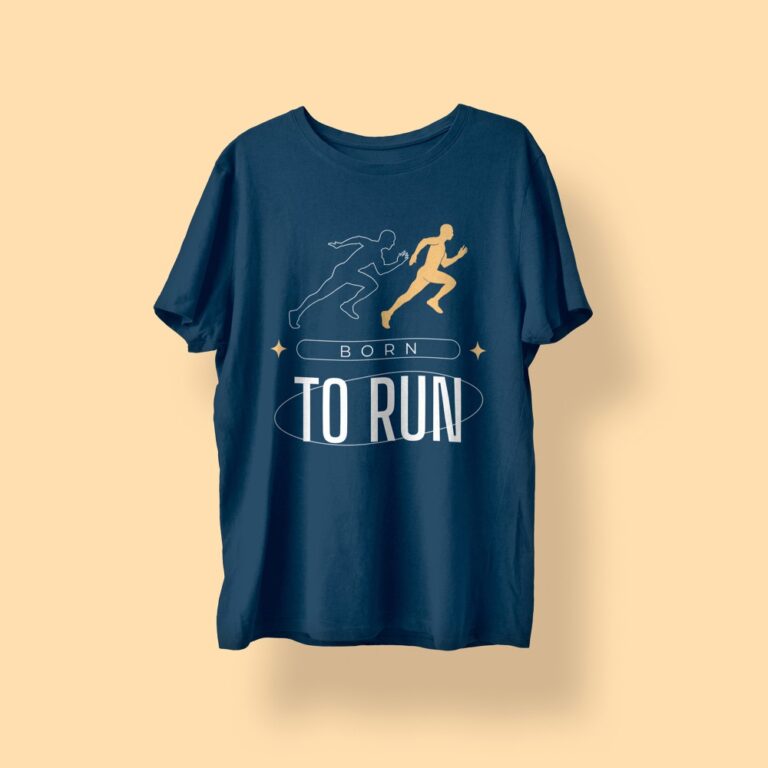


Artwork quality is one of the biggest factors that determines how professional your final print will look. In Vancouver, many t-shirt printing issues happen not because the print shop is bad, but because the design file is not prepared correctly.
Even the best printing method can’t “fix” low-quality artwork.
If your file is blurry, compressed, or not sized properly, the printed result will show:
- fuzzy edges
- pixelation
- poor color accuracy
- unreadable text
- inconsistent details
Below is a clear explanation of why artwork quality matters so much, and how to avoid common mistakes before printing.
Printing shows every flaw (more than screens do)
A design can look perfect on a phone screen because screens are small and hide imperfections. But printing is different.
When your artwork is printed on fabric:
- the design becomes larger
- the texture of the shirt affects sharpness
- ink and heat processes magnify file problems
That’s why a file that “looks fine” online can still print badly on a t-shirt.
1) Low resolution causes blurry, unprofessional prints
Resolution is the #1 reason prints come out soft.
Common causes of low resolution artwork:
- screenshots
- images copied from websites
- social media downloads
- logos taken from Google Images
For professional printing, most shops in Vancouver recommend:
- 300 DPI at final print size
- or a vector file (best option)
If your artwork doesn’t meet that, your design will usually print with rough edges and visible pixels. Avoid blurry t-shirt prints.
2) Incorrect file format reduces print sharpness
File format matters more than people think.
- vector files (AI, EPS, PDF)
- high-resolution PNG (transparent background)
Risky formats:
- low-quality JPG
- compressed images
- files exported for web use
Vector logos stay sharp at any size. PNG files can be excellent too, but only when the resolution is high enough.
3) Compression ruins detail and color
Compression creates artifacts, especially around edges and fine details.
Signs of compression:
- “blocky” shadows or gradients
- rough edges around text
- noise in photo designs
- loss of sharp detail
A compressed file might still look okay on screen, but it will print noticeably worse.
4) Color accuracy depends on artwork preparation
Even with the best equipment, printed colors can shift if artwork isn’t prepared properly.
Common issues:
- wrong color profile
- overly bright neon screen colors
- missing brand color references
- gradients that aren’t clean
If you want consistent colors in Vancouver, it helps to provide:
- Pantone codes (if available)
- brand HEX/RGB values
- a reference image of the intended look
5) Small text and thin lines need perfect files
If your artwork includes:
- small text
- thin outlines
- fine details
- QR codes
…then file quality becomes non-negotiable.
Low-quality artwork will cause:
- unreadable slogans
- broken linework
- QR codes that don’t scan
- rough edges around letters
That’s why print shops often ask for vector files for logo-based designs.
How to ensure your print looks professional
If you want a clean result, use this simple checklist:
- send vector files if possible
- export PNG at high resolution if vector isn’t available
- avoid screenshots and web images
- make sure the design matches the intended print size
- double-check text readability and line thickness
A professional print starts with professional artwork.
Good artwork is the fastest way to get a premium result, and it also speeds up production because fewer corrections are needed, especially when ordering t-shirt printing in Vancouver.