


Fonts play a big role in how people see printed designs. The right font can make a business card look professional, a poster stand out from far away, or an invitation feel elegant.
Designers in 2025 are paying attention to fonts that are versatile, clear, and print beautifully on different surfaces. From banners to booklets, the right typeface brings every project to life.
Read More: 14 Best Fonts for Printing in 2026
1. Helvetica Now

Helvetica has always been one of the most trusted fonts, and Helvetica Now makes it even better. It keeps the clean look of the original but offers improved spacing and readability.
This makes it perfect for everything from business cards to posters. Many designers choose it because it never feels outdated.
Download Helvetica Now Font for Free
2. Garamond
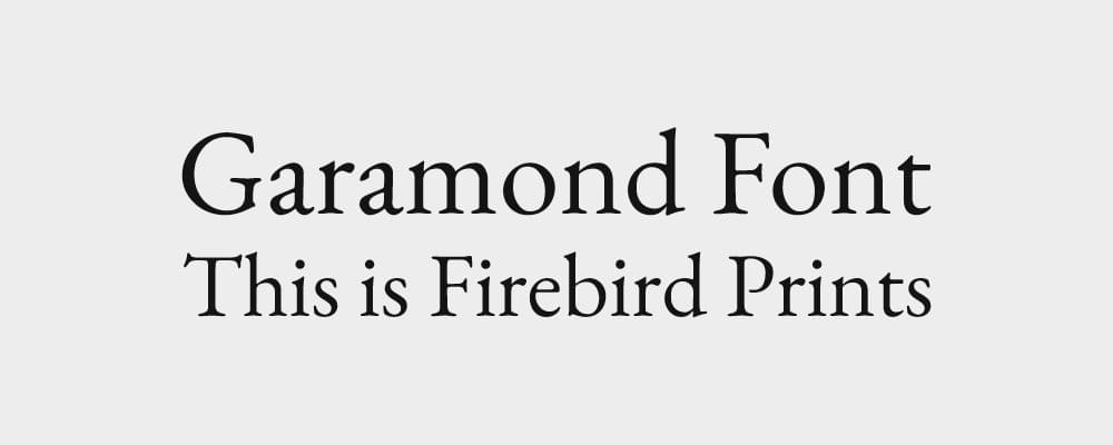
If you’re printing a school yearbook, a booklet, or a magazine, Garamond is an excellent choice.
It has a classic, timeless look that feels warm and easy on the eyes. On paper, Garamond is elegant without being overwhelming, which is why it’s still a favorite for long text.
Download Garamond Font for Free
3. Futura
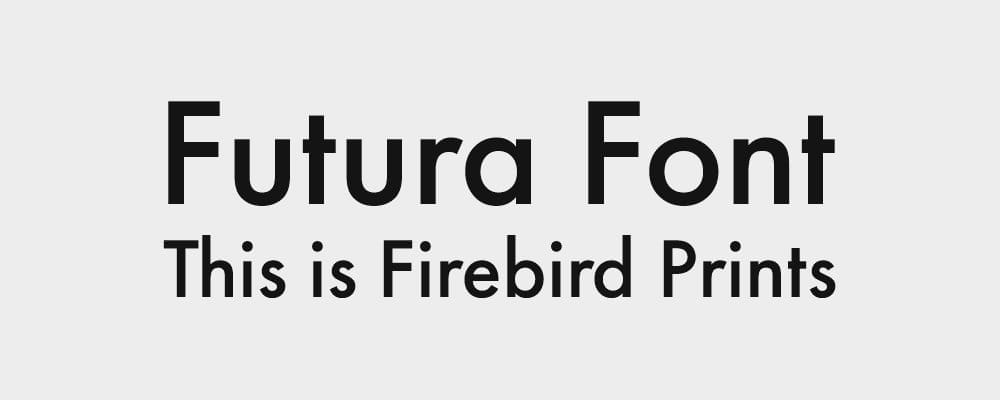
Futura is bold and modern. With its geometric shapes, it looks powerful on large prints like banners, billboards, or event signage.
Designers love it because it’s easy to read from far away while still looking stylish. It brings a fresh, modern energy to school events, retail promotions, and community posters.
4. Montserrat
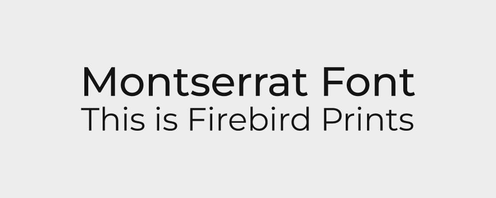
Originally a digital font, Montserrat has become one of the most popular choices for both web and print.
It’s clean, professional, and versatile. Schools often use it in posters and event flyers, while businesses like it for menus and product sheets. It’s modern without being too sharp, which makes it easy to use across many types of projects.
Download Montserrat Font for Free
5. Times Newer Roman (Refined Versions)

It might be considered “old-school,” but Times New Roman has stood the test of time. The updated versions have cleaner spacing and sharper edges, which makes them work well for professional documents, certificates, and formal invitations.
It’s proof that some classics never go out of style.
Download Times Newer Roman Font for Free
6. Avenir Next
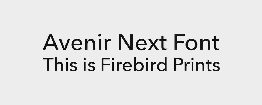
Avenir Next is sleek, modern, and simple. It prints especially well on business cards, flyers, and branded merchandise like t-shirts or tote bags.
Designers often pick it because it’s flexible: it looks just as good in bold headings as it does in small text.
Download Avenir Next Font for Free
7. Baskerville

When elegance is the goal, Baskerville is one of the best. Its refined details make it popular for wedding invitations, certificates, and any printed material where you want to impress.
It pairs beautifully with high-quality paper and professional finishes like embossing or foil.
Download Baskervville Font for Free
Why Fonts Matter in Printing
Not every font that looks good on a screen will look good in print. Thin strokes may disappear when printed small, and bold fonts may smudge if not handled properly. That’s why professional designers carefully test fonts with the right paper and printing method. A good choice balances style with clarity and durability.
How Firebird Prints Helps

At Firebird Prints, we’ve worked with many designers and schools across Vancouver. We know how fonts behave in real printing situations, on glossy brochures, matte posters, fabric, and even large outdoor banners.
Our team helps clients choose typefaces that not only look good but also perform well in print. We also offer finishing touches like UV printing, embossing, and embroidery that make fonts pop even more.
Fonts set the tone of your message. Whether it’s a formal invitation, a fun student t-shirt, or a bold event banner, the right font combined with professional printing ensures your design leaves a strong impression in 2025 and beyond.


