The best font for printing is one that remains readable at its actual size, on its actual material, through the chosen production method.
A clean typeface is a useful starting point, but no font stays equally clear on a cotton shirt, a distant banner and a tiny giveaway. Start with your brand’s approved fonts if you have them. Then test the words as they will appear on the finished item.
This guide helps you choose and prepare lettering for print. For garments and available decoration options, see custom T-shirt printing. For display products, see banners and signage. Those pages cover the products and ordering details; the choices below are about typography.
Choose for the finished piece, not the font preview
| Where it will appear | Usually a useful starting point | What to test |
|---|---|---|
| Shirt slogan or event apparel | Open, sturdy letter shapes and enough space between letters and lines. | Read the exact words at the planned print size. Inspect thin lines, counters inside letters and how the design sits on fabric. |
| Banner or sign | Short message, strong contrast and a clear hierarchy between headline and details. | View a scaled mockup from the expected distance; check whether condensed or all-cap text still reads quickly. |
| Small promotional imprint | Simple shapes, modest copy and a weight that survives the available imprint area. | Print a paper proof at 100% physical size, then confirm the supplier’s imprint area and process. |
| Embroidered name or logo | Letterforms that can be adapted to stitched lettering. | Ask for a stitch-ready proof or sample. Tiny gaps, fine serifs and small lowercase details may need redesign. |
These are starting points, not guaranteed font sizes or production tolerances. Material, ink or thread, colour contrast, equipment and layout all affect the result.
6 useful font families, with limits
These families are available through their linked Google Fonts pages. They are options for new artwork, not substitutes for a required brand font. The links open the correct family specimen so you can inspect styles, character coverage and licence details.
Inter: clear supporting text
Inter is a practical candidate for contact details, labels and short supporting copy. Try regular or medium weights before using very light text. Its open shapes are helpful, but a dense block of text can still fail on a small or textured imprint.
Source Sans 3: information that must be read
Source Sans 3 is worth testing for longer instructions or small secondary details when a plain sans serif suits the brand. Keep line length, contrast and physical size in check; choosing a readable family does not rescue copy squeezed into an inadequate space.
Montserrat: short, prominent words
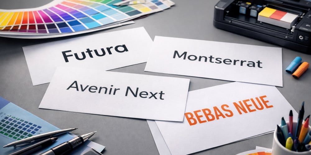
Montserrat can give a slogan or sign heading a strong geometric look. Use a sufficiently substantial weight and leave room around the letters. Its wide forms can consume space quickly, so do not shrink an entire headline simply to make it fit.
Oswald: a narrow headline when space is tight
Oswald can fit a short headline into a narrower area. Test it from the intended viewing distance. Condensed type is a layout choice, not a way to make a long message legible on a small banner.
Lora: editorial text on suitable stock
Lora offers a serif option when the design calls for a warmer, editorial feel. It can work for readable printed paragraphs at an appropriate size on suitable material. Check the finer parts of the letters in a real proof before moving it to a small garment or merchandise imprint.
Playfair Display: a large, brief accent
Playfair Display suits a short, prominent phrase when its fine details have room to show. It is a risky default for tiny copy or small embroidery. Pair a display face with a simpler typeface for the information a customer actually needs to read.
A brand font may be the better choice. Helvetica Now, Avenir Next or another licensed family might already be part of your identity. Use the exact licensed font if it fits the finished application; do not replace it with a similarly named download from an unrelated site. These six suggestions are a shortlist for testing, not a ranking of every typeface.
What changes between print and embroidery?
On a printed shirt, the method and fabric affect how thin strokes, tiny gaps and fine details reproduce. A lettering design should be judged at its planned dimensions and decoration method, ideally with a production proof. If you are still choosing a garment and printing route, the custom T-shirt printing page is the place to review the service.
Embroidery translates artwork into stitches. A font that looks clean on screen cannot simply be assumed to sew cleanly. Letter height, spacing, fabric, thread and digitizing matter.
Embroidery fonts have their own recommended size ranges; small lowercase letters can be harder to reproduce than capitals at the same nominal setting. Send the actual wording and garment to the custom embroidery team for a suitable proof rather than promising one universal minimum letter size.
For a sign, the main constraint is often how quickly someone can read it at the intended distance. Cut a long sentence before trying narrower letters. Give the headline a clear role and keep essential details distinct. The banners and signage page covers the available formats once the message and use are decided.
Prepare type for a reliable proof
- Set the final words and dimensions. Include the actual garment colour or sign background, planned print area and intended viewing distance. A screen zoom level is not a physical size.
- Check legibility at 100% size. Look at similar shapes such as I, l and 1, and at closed spaces inside letters. Test the real slogan, not just the font’s sample alphabet.
- Keep an editable original. Share the approved artwork in the format your printer requests. A production copy with outlined text can preserve letter shapes; outlining removes normal text editability. If sending a PDF with live text, confirm the font can be embedded and displays correctly.
- Check the font licence. Google Fonts families are published under open-source licences that permit commercial use, but check the chosen family’s licence and source. Commercial fonts may have separate permissions for use and embedding. Avoid third-party sites advertising paid families as “free.”
- Approve the production proof. Confirm spelling, spacing, colour contrast and actual placement. If a detail is too fine, adjust size, weight or wording before production.
Need help choosing between an editable vector file and a raster image? The vector vs PNG artwork guide explains that file decision. This page stays focused on the lettering itself.
Frequently asked questions
No. A readable size on smooth paper can fail on fabric or at a distance, and different print processes have different limits. Test at final size and confirm the supplier’s specifications rather than relying on a universal point-size rule.
No. A serif can work well on appropriate stock at a suitable size, and a decorative script can work for a short, large phrase. Fine details and connected letters need closer inspection on small imprints, textured fabric and embroidery.
Keep an editable original. For the production copy, follow the printer’s requested format. Outlines can prevent substitution but make the words harder to edit; a correctly exported PDF with permitted embedded fonts may also be appropriate.
If your logo uses a specific typeface, send the approved artwork and brand guidance. For new text, share the exact words, final size, item, colour and preferred look. The team can review how the design fits the chosen production method before you approve a proof.