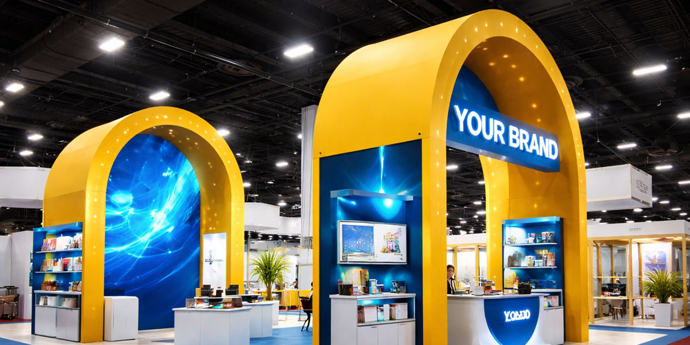
A visually attractive booth is not enough to succeed at a trade show. Many booths look impressive from a distance but fail to pull people in or convert conversations into real leads.
The difference between a booth that simply looks good and one that performs well comes down to flow, positioning, messaging, and smart lead capture planning.
This guide focuses on how to design a booth that actively attracts visitors, keeps them engaged, and turns interactions into measurable results.
Start With Visitor Flow, Not Just Visual Design
One of the most overlooked parts of booth design is how people physically move through the space. If attendees feel blocked, confused, or unsure where to stand, they will keep walking.
Good booth flow means:
- A clear and open entrance
- No furniture blocking the front
- Space for people to step in without feeling trapped
- Logical placement of displays that guide the eye inward
Design your booth like a welcoming environment, not a wall people stand in front of. If you are planning structural elements or display systems, reviewing options for custom trade show booths can help you choose layouts that naturally support better visitor movement.
Your Front Zone Should Invite, Not Intimidate
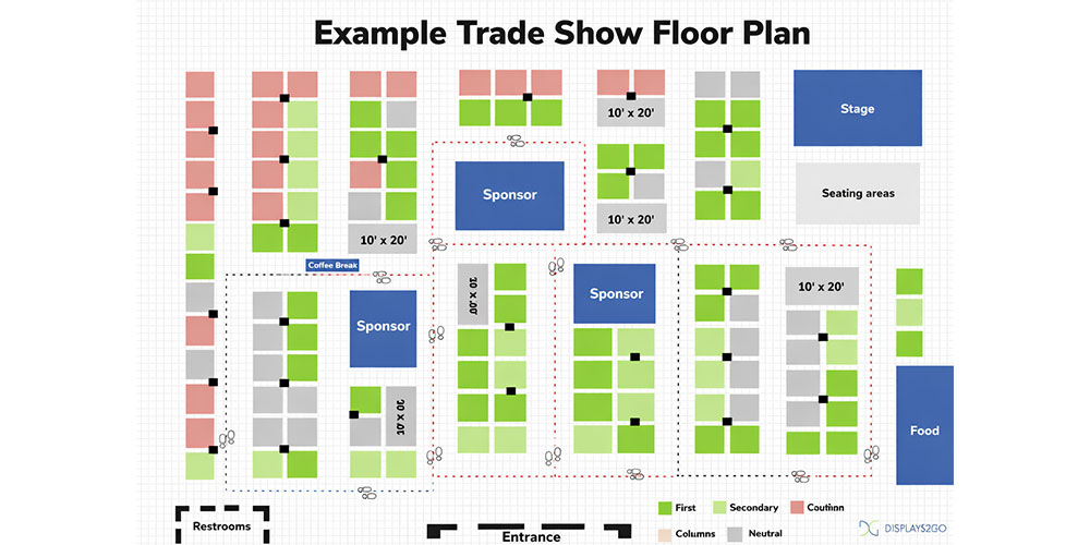
The first two seconds decide whether someone stops or keeps walking. Your front area should feel approachable and easy to enter.
Avoid:
- Tall counters across the entire front
- Staff sitting behind tables
- Overcrowded product displays at the entrance
Instead:
- Keep the center open
- Place narrow counters to the sides
- Let staff stand near the aisle edge with open body language
This creates a subtle psychological signal that visitors are welcome inside.
Design Clear Visual Hierarchy With Signage Positioning
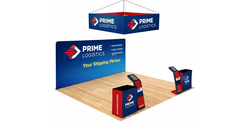
Many booths fail because their signage is poorly positioned or overloaded with text.
The Three-Level Signage Rule
Level 1 – Long Distance (Aisle View)
Your main headline should be high on the back wall or upper structure, readable from several meters away.
Level 2 – Mid Distance (Approach Zone)
Secondary messages such as benefits or services should sit at eye level on side panels or backdrops.
Level 3 – Close Range (Inside Booth)
Detailed information, product specs, or case studies should only appear where people stand inside the booth.
This layered structure prevents information overload while guiding people deeper into the space.
Use Layout to Support Conversation, Not Just Display
A high-performing booth is designed around human interaction.
In smaller booths:
- Keep one clear standing conversation zone
- Avoid filling the floor with product stands
In larger inline booths:
- Use the front for quick chats
- Use the back for deeper discussions or demos
If your booth layout supports natural conversations and visitor movement, your team will engage more people without feeling rushed.
Before choosing giveaways, many companies prepare their booth displays and printed materials. A practical checklist on what to print for a trade show booth explains which banners, signage, and handouts are commonly used at events.
Make Your Call to Action Visible and Simple
A booth without a clear call to action wastes opportunities. Visitors should instantly understand what to do next.
Examples of effective booth CTAs:
- “Get a Free Sample”
- “Book a Quick Demo”
- “Enter to Win”
- “Scan to Download the Guide”
Your CTA should appear:
- On the main backdrop
- On counters or podiums
- On digital screens if used
Keep the action simple and fast. Trade show visitors are busy and easily distracted.
Plan Lead Capture Into the Layout From the Start
Lead capture should not feel like an afterthought. It should be built into your booth flow.
Best practices include:
- A tablet or device positioned near the conversation area
- A quick form that takes less than 30 seconds
- A clear incentive tied to the CTA
- Staff trained to transition naturally from conversation to sign-up
Avoid placing lead capture at the very back where people hesitate to go. It should sit where engagement already happens.
Staff Positioning Is Part of Booth Design
Even the best booth design fails if staff hide behind furniture.
High-performing booths usually have:
- One team member near the aisle greeting visitors
- One team member inside handling conversations
- No one sitting unless in a scheduled meeting
Your layout should support staff mobility and eye contact with passersby.
Design for Attention First, Details Second
Many brands try to communicate everything at once. That overwhelms visitors.
Focus on:
- One strong headline
- One key visual
- One clear action
Everything else should support those three elements. Simplicity improves recall and increases the chance that people stop.
Turning Booth Design Into Measurable Results
An attractive booth may win compliments, but a strategically designed booth wins leads. When flow, signage, CTA placement, and lead capture are planned together, your booth becomes a conversion space, not just a display.
If you want your structure, graphics, and layout elements to work together instead of competing for attention, exploring professionally designed custom trade show booth solutions can help align your physical setup with your marketing goals.
FAQ – Designing a High-Converting Trade Show Booth
1. What makes a trade show booth attract more visitors?
Booths that attract more visitors usually have an open entrance, a clear main message visible from a distance, and staff positioned near the aisle to greet people.
When the layout feels welcoming and easy to step into, more attendees feel comfortable stopping.
2. How important is booth layout for lead generation?
Booth layout directly affects lead generation. If visitors cannot move comfortably inside or do not understand where to stand, conversations are shorter and fewer leads are captured. A layout that supports natural flow leads to more meaningful interactions.
3. Where should the main headline be placed in a trade show booth?
The main headline should be high on the back wall or upper display structure so it can be read from the aisle. This helps attendees understand what you offer before they even reach the booth.
4. What is the best place to position a call to action in a booth?
A call to action should be visible in multiple places, especially on the main backdrop and near engagement areas like demo stations or counters. It should be easy to understand within a few seconds.
5. How do you design a booth for better visitor flow?
Keep the center open, avoid placing large tables across the front, and arrange displays so they guide visitors inward. The goal is to make the booth feel like a space people can enter, not just something they look at from outside.
6. What is the most common mistake in trade show booth design?
One of the biggest mistakes is overcrowding the space with too many messages, products, or banners. This creates visual noise and makes it harder for visitors to quickly understand what the company does.
7. How should staff be positioned inside a booth?
Staff should stand near the front corners or entrance area to greet visitors. Sitting behind tables or staying at the back reduces engagement and makes the booth feel less approachable.
8. Does booth design really impact conversions?
Yes. A booth that is designed for interaction, with clear messaging and simple lead capture, will consistently generate more qualified leads than a booth that only focuses on visual appearance.
