
When people order custom t-shirt printing, they usually spend most of their time thinking about the design. But in real production, one decision often makes the biggest difference in how the final shirt looks:
Print placement.
Where your logo or artwork sits on the shirt affects everything:
- how premium the product feels
- how visible your branding is from a distance
- how people take photos of it (and share it)
- how long the print stays looking clean
- and whether the shirt looks “professional” or “random”
If you’re ordering custom t-shirts in Vancouver for staff uniforms, events, merch drops, or business branding, this placement guide will help you make the right call with confidence.
Quick Placement Answer (If You Want the Best Default)
If you want the most common and safest placement decisions (the ones that look right 90% of the time):
- Business uniforms: left chest + optional back (small or medium)
- Events: full front or left chest + big back
- Streetwear/merch: big back + small front (center or left chest)
- Minimal branding: small left chest only
- Maximum visibility: large back print
Most Vancouver businesses end up choosing:
- Left chest logo (clean, professional)
- Back print (high visibility at events)
It gives the shirt structure and branding without looking over-designed.
For professional custom t-shirt printing in Vancouver, explore our Custom T-Shirt Printing Vancouver service for pricing, turnaround times, and ordering options.
Why Placement Matters More Than You Think
Placement is not just “where it looks cool.”
It controls three major things:
1. Brand visibility
You might have the best logo, but if it’s printed too low or too small, it disappears in real life, especially at trade shows or outdoor events.
2. Perceived quality
Premium brands often print with intention:
- balanced margins
- consistent sizing
- clean positioning
- not too high, not too low
Cheap shirts often look cheap because placement is off.
3. Wearability
A shirt can be “technically correct” and still feel wrong if the print is too wide, too high, or too close to the collar.
Good placement makes the shirt wearable. Wearable shirts get worn more. Worn shirts are the best marketing.
The 5 Most Popular Print Placements for Custom T-Shirts
Here are the common placements and when each one makes sense.
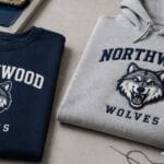
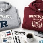
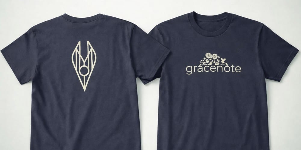
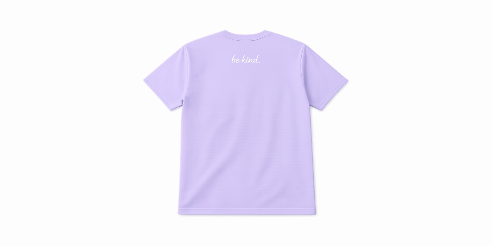
1. Left Chest Print (The Best Choice for Professional Branding)
If you’re printing for a business in Vancouver, left chest is the most reliable, clean, professional option.
It works great for:
- staff shirts
- team uniforms
- construction/service companies
- retail staff
- clinics and wellness businesses
- any brand that wants a corporate look
Best for:
- logos
- monograms
- simple icons
- short brand names
Typical size range:
- Width: 3 to 4.25 inches
- Height: 3 to 4 inches
Why it works so well
Left chest prints don’t try too hard. They feel intentional. They look premium even when small.
That’s why left chest is often the top choice for business uniform t-shirt printing.
Common mistakes (avoid these)
- making it too large (it becomes awkward)
- printing too close to the collar
- placing it too far toward the armpit
If you want a clean uniform look, left chest is usually the smart move.
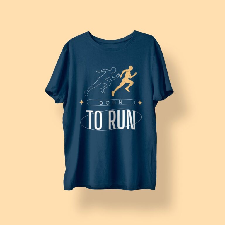
2. Full Front Print (Best for Events, Teams, and Bold Branding)
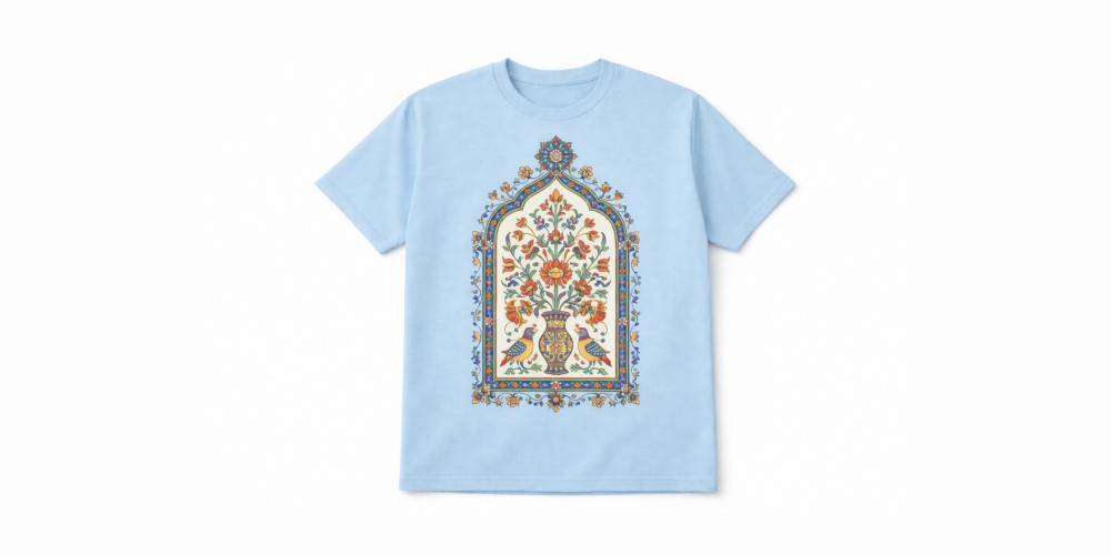
Full front print means the artwork is centered on the front of the shirt, larger than a left chest logo.
It’s the placement you see on:
- event shirts
- charity runs
- festivals
- promo t-shirts
- bold brand campaigns
Best for:
- big logos
- typography designs
- slogans
- simple graphics with high contrast
Typical size range:
- Width: 9 to 12 inches
- Height: 10 to 14 inches
When it performs best
Full front print is ideal when people need to recognize the shirt quickly from the front.
It is also excellent for photos because most photos capture the front of the shirt naturally.
Mistakes to avoid
- super wide designs that stretch into the armpit area
- small design centered too low
- printing too high so it sits on the chest awkwardly
Full front print can look very premium when the spacing is correct.
Print placement is important, but size also affects visibility. Our T-Shirt Print Size Guide explains how large each design should be
3. Back Print (The Highest Visibility Placement)
If your goal is visibility at Vancouver events, exhibitions, and outdoor marketing, back print is the most effective placement.
Because when people walk around, they turn, stand in lines, talk to others, and move through crowds.
The back of the shirt gets seen constantly.
Best for:
- large logos
- staff identification (“CREW”, “STAFF”)
- event sponsors
- large graphic designs
- merch drops
Typical size range:
- Width: 10 to 12.5 inches
- Height: 10 to 14 inches
Back print positioning options
There are 2 common ways:
Option A: Upper back (between shoulders)
This looks clean and premium.
Option B: Full back (bigger and louder)
This is the “maximum attention” option.
Mistakes to avoid
- placing it too low, it looks sloppy and sinks into the body shape
- small print on the back, it looks “unfinished” unless it is intentional
If you want the strongest branding impact, back print is a top-tier choice.
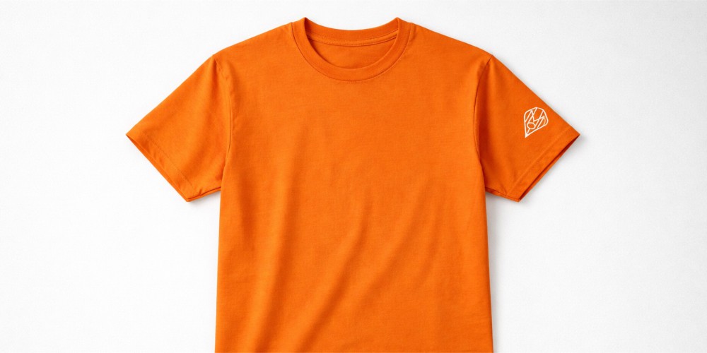
4. Sleeve Print (Small Detail that Looks Premium)
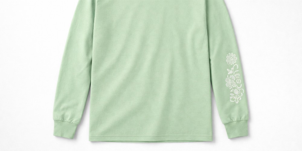
Sleeve prints have become more popular for modern business and merch branding.
They look clean because they are subtle but intentional.
Sleeve prints work great for:
- gyms and fitness brands
- streetwear
- premium business branding
- construction and trades (small sleeve logo + left chest)
Best for:
- logos
- icons
- small wordmarks
- social handle (short)
Typical size range:
- Width: 2 to 3.5 inches
- Height: 2 to 3.5 inches
Common mistakes
- using too much detail (sleeves are small)
- using long text that wraps weird
- placing too far back
Sleeve prints are not designed to be the “main design.” They are a finishing touch.
5. Front Center Small Print (Modern Minimalist Style)
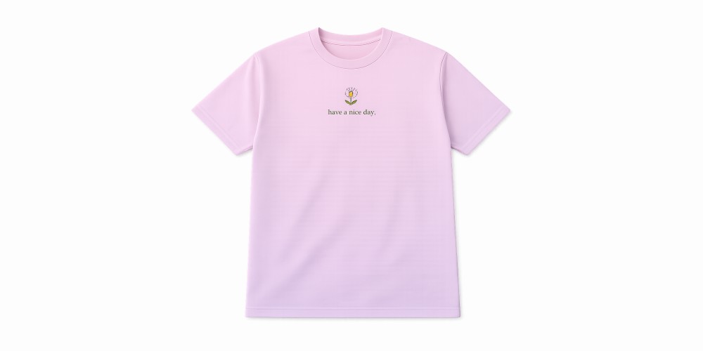
This placement sits centered on the chest but smaller than a full front print. It is popular with brands that want a calm, clean look.
Great for:
- minimal logos
- premium branding
- simple icons
Typical size range:
- Width: 4 to 6 inches
- Height: 4 to 6 inches
This placement gives a different feel than left chest. It looks more “fashion brand” and less “uniform.”
What Placement Should You Choose Based on Your Goal?
This is where most people get stuck, so here’s a very practical guide.
If you want a professional uniform look
Choose:
- Left chest logo
Optional add-on: - small upper back (company name or “STAFF”)
This is the cleanest business setup.
If you want maximum event visibility
Choose:
- Large back print
Plus: - left chest logo or small front center
Back print carries your brand. Front print makes it recognizable in photos.
If you want premium minimal branding
Choose:
- Front center small print or left chest
Optional:
- sleeve print
This is the “expensive” look.
If you’re printing merch to sell
Choose:
- Big back
Plus: - small front (left chest or center)
This combo is extremely common in modern streetwear.
Best Placement Combos That Always Work
Here are 5 combos that almost never fail:
- Left chest only
Best for: uniforms, clean branding - Left chest + full back
Best for: staff, event teams, visibility - Small front center + big back
Best for: merch drops, premium feel - Left chest + sleeve
Best for: minimal branding with detail - Full front only
Best for: promo shirts, bold campaigns
For Vancouver business orders, combo #2 is usually the most effective and safest.
If you want help choosing the best placement combo for your team shirts or event order, request a quick quote and we’ll recommend the best setup based on your design and quantity.
Print Placement Size Guide (Real Numbers)
This section matters because many people say “make it medium” and then hate the result.
Here are common sizing guidelines:
Left Chest Logo
- Small: 3″ wide
- Standard: 3.5″ to 4.25″ wide
- Large: 4.5″ wide (not recommended unless design is extremely simple)
Full Front
- Standard: 10″ to 11″ wide
- Large: 12″ wide
Full Back
- Standard: 11″ wide
- Large: 12.5″ wide
Sleeve
- Standard: 2.5″ to 3″ wide
If you want your shirts to look clean and premium, don’t oversize everything. Oversizing looks aggressive and cheap unless done in streetwear style intentionally.
Common Placement Problems (And How to Avoid Them)
Problem 1: “My logo looks too small”
This happens when the design itself is thin or detailed.
Fix:
- simplify the logo
- increase width slightly
- use a bolder version of the logo for apparel
Problem 2: “The shirt looks unbalanced”
This happens when:
- print is too low
- print is too close to collar
- print doesn’t match the shirt size scale
Fix:
- choose proper top margin
- adjust sizing per shirt size (S vs XL)
Problem 3: “The design doesn’t look centered”
This is common on:
- pocket tees
- side seams
- fitted shirts
Fix:
- use professional alignment marks
- avoid printing too close to seams
Problem 4: “The back print feels too loud”
This happens when the back print is too big or too bold for the shirt style.
Fix:
- move to upper back
- reduce design width
- use a softer color approach
Placement Recommendations for Vancouver Business Orders
If you run a business in Vancouver and you’re printing custom t-shirts for staff, the smartest approach is usually:
- left chest logo
- small back print (company name)
- or full back print (if you want visibility)
This setup:
- looks professional
- works for staff photos
- builds local brand recognition
- helps customers identify team members
A Simple Checklist Before You Order T-Shirts
Before you approve your order, check these:
- Is the logo placed with enough margin from collar and seams?
- Is the sizing readable from 10 feet away?
- Will it look good in photos?
- Does it match your brand style (minimal vs loud)?
- Does the placement match how the shirt will be used (uniform vs merch)?
Most bad orders happen because people rush this step.
Print placement can make the difference between:
- a shirt that feels premium and gets worn
- and a shirt that feels awkward and stays in a drawer
If you want the safest “always looks good” order, go with:
- Left chest logo
- plus back print (upper back or full back)
It delivers the clean uniform look while still giving your brand serious visibility around Vancouver events, job sites, and public spaces.
If you want your t-shirts to look clean, professional, and consistent, our team can help you choose the right placement and sizing. See our Custom T-Shirt Printing Vancouver options to get started.
If you’re unsure, ask your print shop for a placement proof. A professional shop will help you choose sizing and positioning that fits your shirts, brand, and goals.